
Güçlü Öğrenme Akademisi
A scientific, warm and parent-friendly web experience for a Kırıkkale center specializing in learning difficulty, dyslexia, attention and autism assessment.
Visit site ↗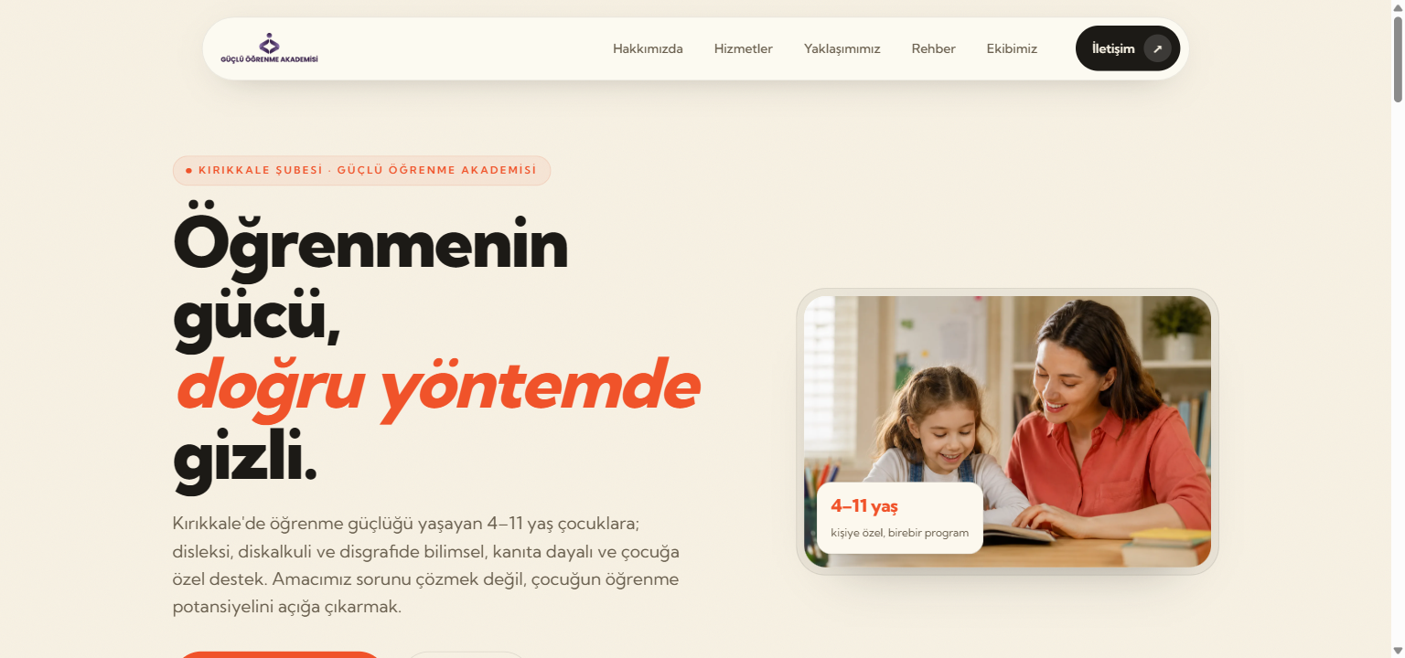
For Güçlü Öğrenme Akademisi’s Kırıkkale branch — a center specializing in learning difficulty, dyslexia and attention assessment — a scientific yet warm digital welcome that reassures parents.
Problem
Learning difficulty is a sensitive topic: the parent is anxious and wants trustworthy information and a credible center. The center had no online presence; its services, the tests it uses and questions like “when should I see a specialist” weren’t gathered in one clear, readable place.
Solution
- Eight dedicated, in-depth landing pages, one per service (dyslexia, attention/MOXO, intelligence & giftedness, autism assessment, counseling…)
- A parent guide blog that helps families recognize early signs, each post linked to the right service
- A clear content architecture tying every service to its authoritative test set (WISC-R, ASIS, MOXO, GOBDÖ2…)
- Honest, guiding content free of hype and the cliché “AI feel”, keeping referral-to-physician language
- Mobile-first responsive build + LocalBusiness structured data for local visibility
Technology
For special-education and child-development centers a website isn’t a brochure; it’s the anxious parent’s first point of contact and a trust-building tool. The structure we built for Güçlü Öğrenme Akademisi presents the right information in a sensitive tone and drives appointments — our reference for education institutions that need a “learning difficulty / dyslexia center website”.
FAQ
Why is a health/education center site built differently? +
The visitor is an anxious parent; the site must build trust first, explain the service and the process honestly, and drive an appointment without hype while keeping referral-to-physician language. It needs a different tone and architecture than a commercial showcase.
How is content handled for sensitive topics? +
No medical diagnosis or claims; signs are described, “when to see a specialist” is clarified, and referral to a physician is given where needed. The goal is to inform and reassure, not to sell fear.