
Live · free · open source
Algow Yangın
A free live map of wildfires in Turkey — where each fire came from, and where the wind may carry it next.
If you see a fire, call immediately: 112 emergency · 177 forest fire line. This map is not an official warning system.
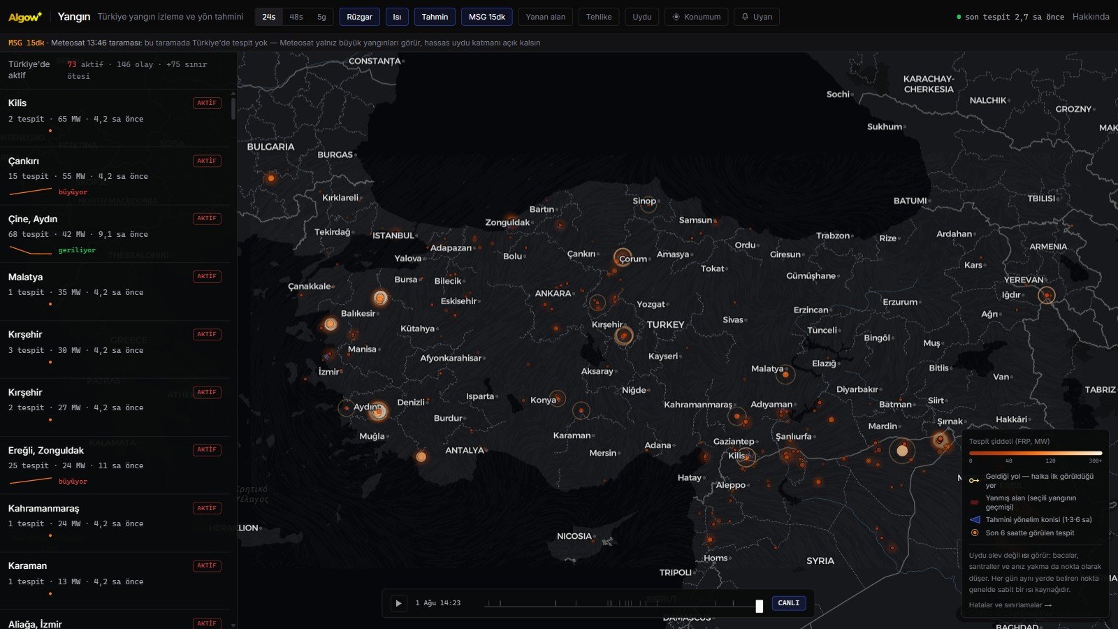
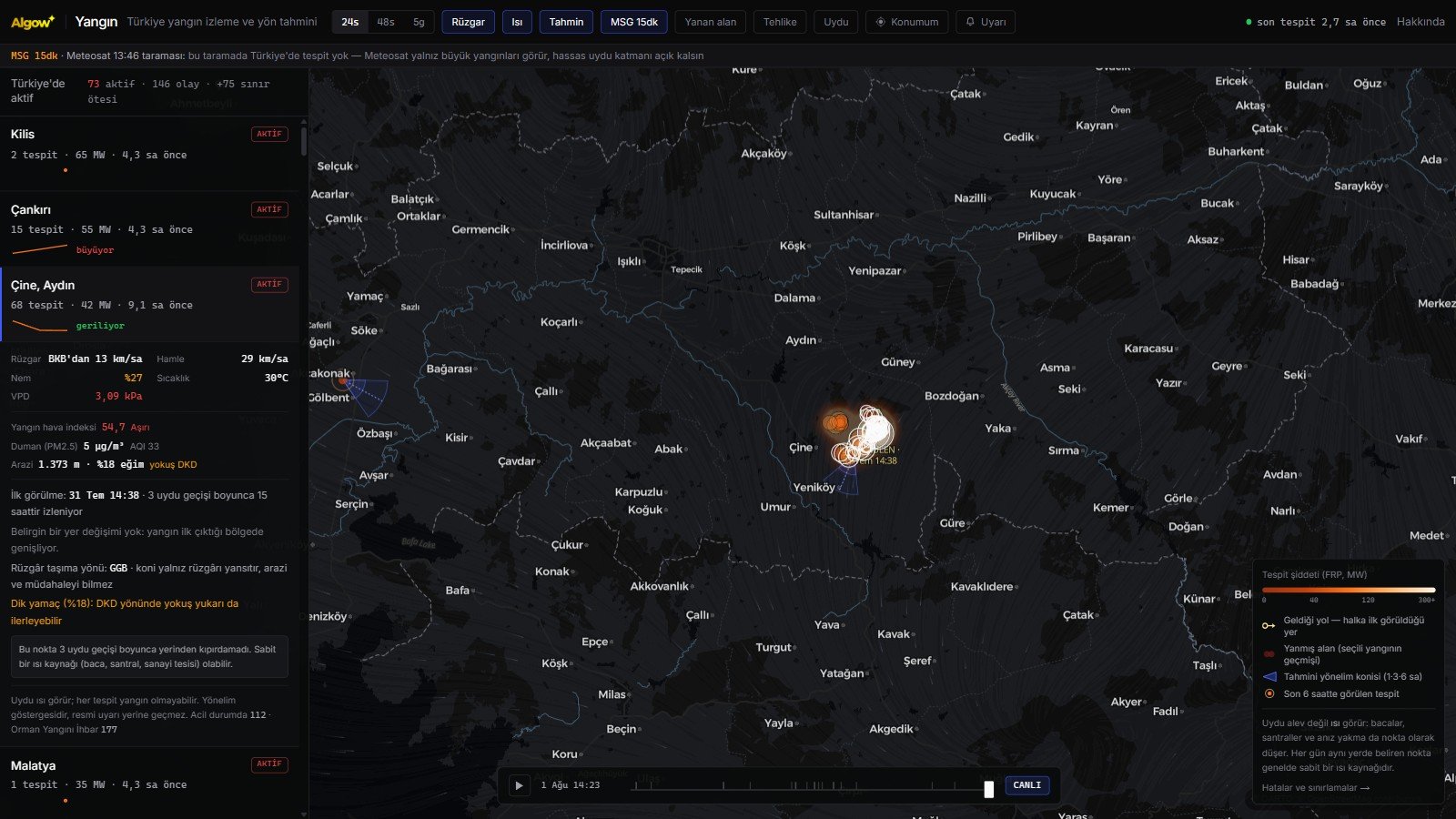
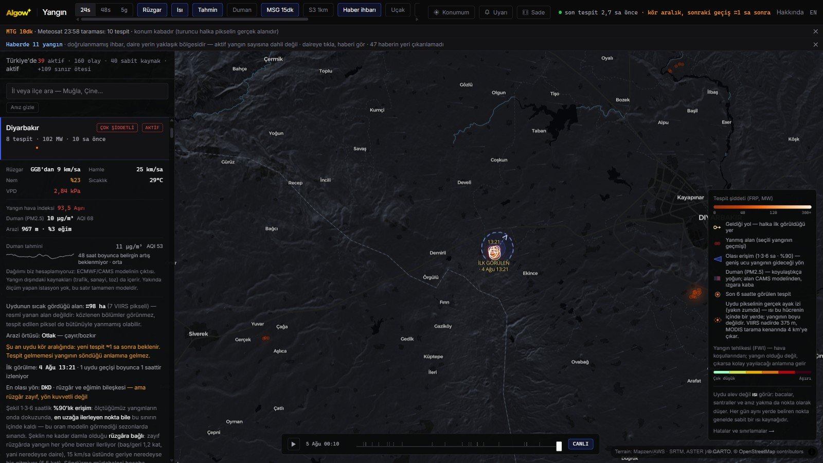
Screenshots from the 5 August 2026 release. Earlier release screenshots remain archived — 2 August: country view · event detail · terrain · 1 August: country view · event detail.
What the map shows
Live detections
Fire detections from five satellites, refreshed every ten minutes; intensity read through colour and size.
Where it came from
The first sighting is marked and the path across satellite passes is drawn with arrows and timestamps.
Where it may go
Likely reach computed from wind combined with terrain slope; its shape and size were measured across six fire seasons. How elongated the shape gets depends on the wind: in light wind a fire advances almost equally in every direction, so it is nearly a circle; above 15 km/h it barely moves backwards, so it becomes a teardrop.
How our forecasts score
Every cone we draw is recorded and compared, at the next satellite pass, with where the fire actually went. The season scorecard — median direction error, hit rate, how often the shape contained the advance — is public on the statistics page. Numbers tested against data that arrived after the forecast.
A gas flare is not a fire
Our satellite window also covers neighbouring countries, and most of the large power readings in Syria and Iraq are not fires but gas flared at oil wells — industrial heat that never goes out. We do not remove them from the map, but they now sort last, so a flare cannot push a real forest fire down the list.
Clean view
The "Clean" button in the top strip hides the top strip itself, the side panels and the data-source notes, leaving just the map — for screenshots, or simply for looking at the map. The handle at the top right, or ESC, brings it back. In this view the Algow signature sits at the bottom left and a very faint yangin.algow.net watermark covers the map. Each information band at the top also has its own ×, which gives the map noticeably more room on a phone.
Topography
A hillshade layer reveals valleys and ridges, making it visible why the cone leans the way it does.
Today's satellite view
NASA GIBS daily true colour: coarse resolution but today's date, so smoke from large fires is visible. Plus a 10-metre Sentinel-2 basemap.
Stubble or forest
Land cover of the selected fire is shown, so agricultural stubble burning is not mistaken for a wildfire.
Blind-window notice
If you are between satellite passes the map says so: no detection does not mean the fire is out.
Fire weather
Wind, gusts, humidity, temperature, vapour pressure deficit and the Canadian Fire Weather Index.
Industry or wildfire
Satellites see heat, not flame; refineries and steel plants run hot every day. Locations showing heat on more than 40 separate days were separated by measurement and removed from the fire count — they stay on the map, with the reason stated.
Smoke and smoke forecast
Surface fine particle (PM2.5) levels and when they peak over the next 48 hours — the most relevant reading for people kilometres away. Dispersion is computed by CAMS, Europe's atmosphere monitoring service.
Firefighting aircraft
Aircraft and helicopters working a fire appear on the map with their type and registration; the icon shows whether it is a fixed-wing or a helicopter and which way it is heading. The source is an open ADS-B network run by volunteers: we know the type, not the mission — and an aircraft that does not broadcast will not appear.
Greece is covered too
The map now also sees mainland Greece, the Peloponnese, the Ionian islands and the whole of Crete. Fires in neighbouring countries carry an "abroad" badge and are excluded from the Türkiye counter.
Sentinel-3 satellite
Europe's SLSTR instrument adds about four passes a day at 1 km. Sharper than Meteosat but slower: roughly two hours pass between sensing and publication. It also reports its own error margin, which is why we can say "30 ± 4 MW".
The pixel's true size
Zoom in and each detection gets a dashed ellipse around it: that is the cell the heat sits inside, not the size of the fire. The cell is 375 m at best and grows to 4 km at the edge of the swath — so you can see why a position sometimes looks off.
Doubtful detections are not counted
Every detection carries a confidence flag. Low-confidence daytime detections are drawn faint and left out of the active counter; daytime false alarms are mostly sun glint. At night that mechanism does not exist, so night detections are not downgraded.
A page for your province
A separate page for each of the 81 provinces: its season data, how it compares with past seasons, and when and where the highest heat was measured.
Shareable fires
Send a link to a fire and the recipient sees that fire directly; chat apps also show the place, radiative power and duration.
Archive of past fires
The 2021 Manavgat, Marmaris and Milas fires can be replayed end to end from the satellite record.
Terrain
Elevation, slope and upslope direction; flames climb steep slopes regardless of wind.
Time scrubber
Rewind one, two or five days and play back how the fire grew.
Nearby alerts
Save your home, field or workplace and get notified when a fire appears near it.
Works offline
Built for weak rural connections: second launch loads without network, shows last data when cut off.
Data sources
All sources are public and free scientific services. None of them endorse this platform; data is provided as is.
- NASA FIRMS ↗ Active fire detections — VIIRS 375 m and MODIS 1 km, five satellites
- EUMETSAT LSA SAF ↗ Meteosat FRP product — 15-minute scans filling the blind window
- Open-Meteo ↗ Wind, gusts, humidity, temperature, VPD, air quality and elevation
- Copernicus EFFIS / GWIS ↗ Burnt area perimeters and fire danger forecast
- Sentinel-2 cloudless (EOX) ↗ 10 m cloud-free satellite basemap — modified Copernicus Sentinel data
- NASA EOSDIS GIBS ↗ Daily true-colour imagery — smoke from large fires is visible
- Mapzen · AWS Terrain Tiles ↗ Elevation data for hillshading (SRTM, ASTER)
- Natural Earth ↗ Province boundaries — public domain cartographic data
- CORINE Land Cover (EEA) ↗ Land cover — forest, maquis and farmland distinction
- CARTO · OpenStreetMap ↗ Base map and place names
How accurate is it, where does it fail?
The honest answer here is the most important part of the platform. Satellites see heat, not flame: refinery flares, power plants, factories and stubble burning all appear as dots. A dot in the same place every day is a permanent heat source, and the platform flags it.
Errors run the other way too. Fires under cloud, beneath canopy, or extinguished between passes never appear. We tested this against news reports: a small overnight fire was entirely missed, while a large ongoing one was captured with over three hundred detections.
On direction we must be even clearer — because we got this wrong once and corrected it. Our first test rested on twenty-three samples and concluded the forecast was no better than chance. That sample was small enough to mislead us: retested across six seasons and 468,000 detections, the forecast does beat chance, though it remains far from certain (median error 68 degrees against 90 for chance). The same audit showed the cone's size had never been measured and was several times too large; we rescaled the rings against the data and verified the new rate on seasons the model had never seen.
A year after that correction we retested the same claim against ten times the data — because having been wrong once is no proof of being right the second time. Instead of 232 cases from Türkiye we used 2,383 cases and 41,103 cells from eight seasons across the Mediterranean basin. The claim on the site — that nine out of ten of the cells a fire advances into stay inside the shape we draw — held: 90.4% overall, 89.1% for Türkiye alone. Choosing the setting from data outside Türkiye, never seeing Türkiye at all, and then testing it there still gave 89%; holding out each season in turn averaged 90%. The figure is not luck specific to one country or one year.
The things that did not work belong here too. We trained a machine learning model on eight seasons of data; on direction it was a few degrees better than the existing physics model in the geography it was trained on, but in Türkiye the difference vanished into noise. Three separate routes to a narrower cone at the same reliability were tested, and all three stayed below our measurement uncertainty. None of them shipped. We do not break something that works for an improvement we cannot prove.
In short: this is not an early warning system. Fires are first spotted by watchtowers, people on the ground and emergency calls. The value here is bringing together, on one screen, where a fire is, where it came from and where wind may take it.
Those who fell protecting the forests
On 23 July 2025 at Seyitgazi in Eskişehir, the crew working the fire was caught between the flames when the wind turned; five forest workers and five AKUT volunteers fell. Across that season's forest fires in Türkiye 17 lives were given. They walked toward what everyone else runs from.
This platform measures exactly one thing: where the wind is carrying the fire — and it was a turn of the wind that cost those lives at Seyitgazi. That is why we state our accuracy so plainly: overstating a forecast means somebody in the field trusting the wrong thing. We remember them with respect and gratitude.
Frequently asked
What is Algow Yangın? +
A free live map showing wildfires across Turkey using satellite data, with wind-based spread direction estimates. Built by Algow for public and environmental benefit: no ads, no data selling, open source.
Where does the data come from? +
Fire detections come from NASA FIRMS across five satellites (VIIRS on Suomi-NPP, NOAA-20, NOAA-21; MODIS on Terra and Aqua), plus Meteosat via EUMETSAT LSA SAF. Weather and air quality come from Open-Meteo; burnt area perimeters from Copernicus EFFIS.
How current is the data? +
Polar-orbiting satellites pass over Turkey a few times a day, arriving with one to eight hours of delay, typically two to four. Meteosat scans every fifteen minutes and reaches us in about half an hour. The map refreshes itself every ten minutes.
Is every dot really a fire? +
No. Satellites detect heat, not flame. Refinery flares, power plants, steel and cement works, and post-harvest stubble burning all appear as dots. If a dot appears in the same spot every day, it is most likely a permanent heat source.
Can fires be missed? +
Yes. Fires under cloud cover, beneath tree canopy, or extinguished between satellite passes stay invisible. Fires smaller than fifty to a hundred square metres are usually undetectable. Absence of a dot does not prove absence of fire.
How reliable is the direction forecast? +
We measured it: six fire seasons, 468,000 satellite detections, 232 verifiable advances across 79 forest and maquis fires. The forecast beats chance but is far from certain — median angular error 68 degrees (chance would be 90), 33 per cent of forecasts land within 45 degrees, 16 per cent point the wrong way entirely. Direction now combines wind with terrain slope; adding slope cuts completely-wrong forecasts on steep ground from 22 to 11 per cent. We also measured the ceiling: even knowing the true average wind between two passes in advance, median error would only fall to 64 degrees — the remaining uncertainty comes from firefighting and terrain detail, not from weather forecasting.
What does the size of the cone mean? +
The boundary carries a measured promise: in nine out of ten fires we studied, even the furthest-advancing point stayed inside it. That rate was verified on seasons the model had never seen. How elongated the shape gets depends on the wind, and we measured that: in light wind a fire advances almost equally in every direction (only 1.2× further ahead than behind), while above 15 km/h it barely moves backwards at all (5.5×) — so the shape is close to a circle in light wind and a teardrop in strong wind, with the broad end showing where it is heading. To be clear: in the first version these rings rested on no measurement at all and were several times too large. We then said "2.4× at every wind speed"; that measurement was flawed too, because it took the fire's direction from its centre of mass and so counted the flank of a wide front as "backwards". We redid it per 375-metre cell; the new shape both covers more and is smaller.
Is this an official warning system? +
No. It is a situational awareness tool, not an evacuation decision tool. In Turkey call 112 for emergencies or 177 to report a forest fire.
Can I see my own location? +
Yes, and you can save places to be alerted when a fire appears nearby. Your location is processed only on your device; it is never sent to any server.
Does it work on weak connections? +
Yes, by design. The app caches map tiles and the latest data on your device, works offline with the last known data, and disables heavy layers on slow connections. It can be installed on your phone.
The same team writes code for your business.
The team that turns satellite data into a live map also builds corporate websites, custom software, mobile apps and ad campaigns. Based in İzmir, working across Türkiye.